


How can a disciplined capital return strategy influence performance? Get to know the S&P 500 Resilient Shareholder Yield Index.
The posts on this blog are opinions, not advice. Please read our Disclaimers.Tracking Shareholder Yield with Indices
The Anatomy of Resilience: The S&P 500 Resilient Shareholder Yield Index
Beyond Bitcoin – The Manager Perspective: Why Digital Asset Benchmarking Is Entering a New Era
Introducing the S&P 500 Defined Outcome Index Series
Cashing in the Chips?
Tracking Shareholder Yield with Indices
The Anatomy of Resilience: The S&P 500 Resilient Shareholder Yield Index

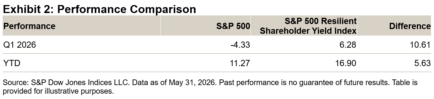
Equity markets have experienced volatility YTD, with Q1 2026 drawdowns driven by geopolitical uncertainty and stretched valuations giving way to a strong rebound in April and May. Amid these market swings, the S&P 500® Resilient Shareholder Yield Index has stood out.
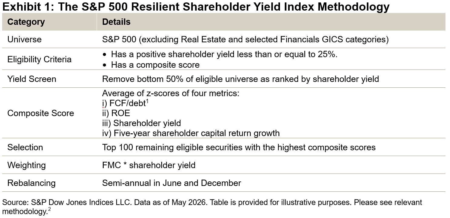
Shareholder yield combines dividends, share buybacks and net debt reduction into a single metric that measures the various ways companies distribute value to investors. The S&P 500 Resilient Shareholder Yield Index focuses on companies that return significant capital to shareholders while maintaining balance sheet strength and cash flow discipline.
YTD Outperformance
In Q1 2026, the S&P 500 Resilient Shareholder Yield Index demonstrated its defensive qualities by outperforming the S&P 500 by more than 10%. Although the broader market has since rebounded, the index has maintained a solid lead, outperforming the S&P 500 by 5.63% YTD.
Q1 2026 Performance Attribution
Exhibit 3 presents the performance attribution for Q1 2026, highlighting the top contributors. The results show that overall performance was primarily driven by stock selection, with sector effects also playing a role.
 Long-Term Performance Characteristics
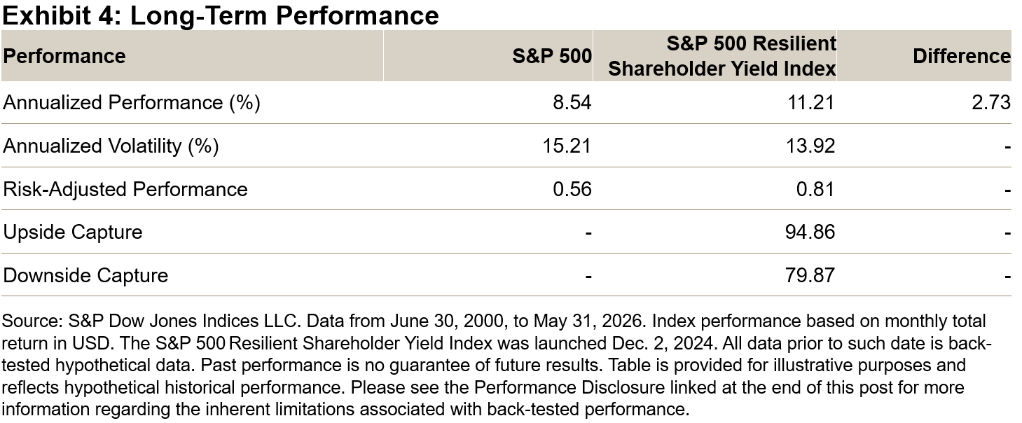
Over the longer term, back-testing indicates that the S&P 500 Resilient Shareholder Yield Index outperformed the S&P 500 by 2.7% annualized since June 2000, with lower volatility and reduced downside capture. Notably, these defensive qualities have not come at the expense of upside participation—the index has tended to perform well during months when the S&P 500 delivered positive performance.
Drawdown Behavior
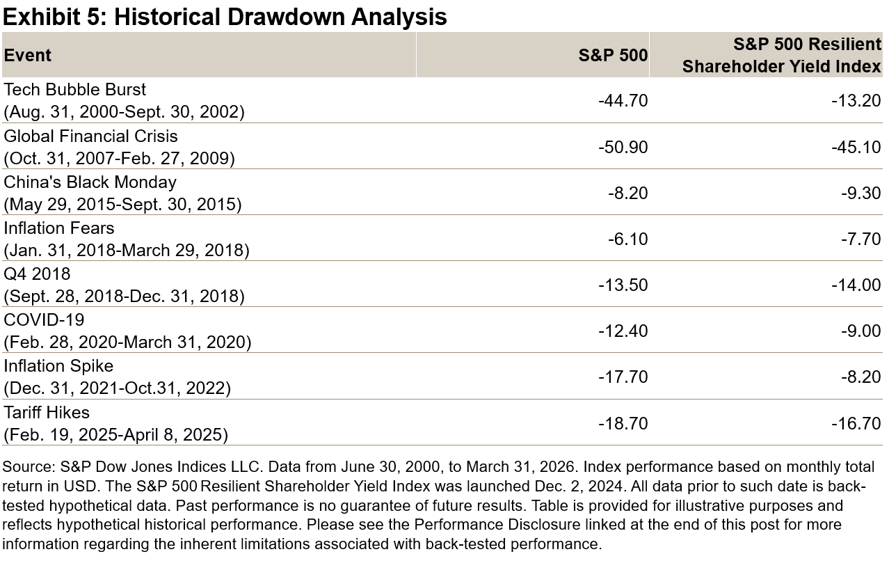
The index’s focus on capital return and balance sheet strength has translated into lower drawdowns in several major market stress events, including the tech bubble, the COVID-19 sell-off and the 2022 inflation shock. The index has historically shown greater resilience during periods of prolonged market stress.
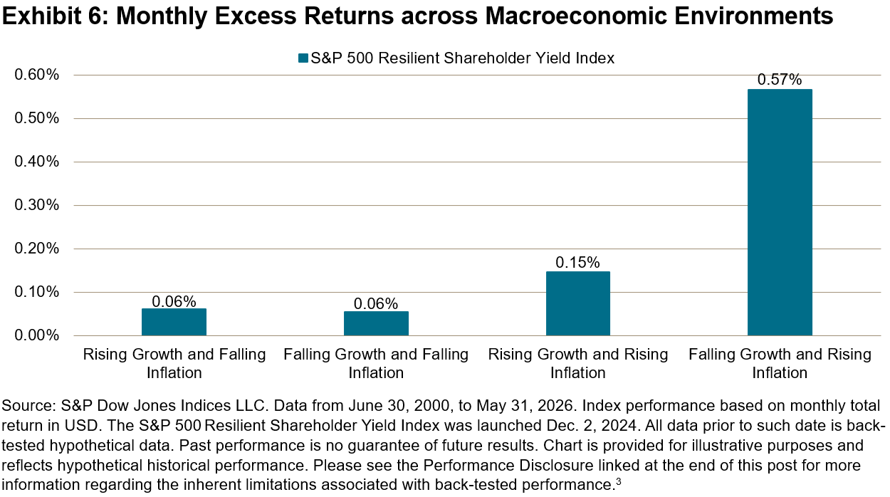
Historical Macroeconomic Performance
Historically, the strongest relative performance has tended to occur during periods of slowing growth and rising inflation. In these environments, income, valuation discipline and lower volatility have been more consistently rewarded—aligning with the index’s emphasis on shareholder yield and quality.
Conclusion
The S&P 500 Resilient Shareholder Yield Index reflects a disciplined approach that prioritizes sustainable capital return and financial resilience rather than dividend yield alone. By combining shareholder yield with quality and balance sheet metrics, the index has historically outperformed the broad market benchmark during periods of market stress and recovery.
1 Free cash flow (FCF) comprises operating cash flow minus capital expenditure.
2 Methodology is available at: https://www.spglobal.com/spdji/en/methodology/article/sp-500-shareholder-yield-indices-methodology/
The posts on this blog are opinions, not advice. Please read our Disclaimers.Beyond Bitcoin – The Manager Perspective: Why Digital Asset Benchmarking Is Entering a New Era

As institutional capital moves deeper into digital assets, one question is becoming increasingly relevant: what, exactly, should crypto fund managers be measured against?
That was the central issue in a recent webinar, “Benchmarking Digital Asset Funds: Are Managers Measuring Performance Effectively?” hosted by Crypto Insights Group with participation from S&P Dow Jones Indices (S&P DJI), Amitis Group and Syncracy Capital. The discussion brought together the perspectives of S&P DJI, an index provider with a range of S&P Digital Asset Indices, an active manager and a fund allocator—offering a useful snapshot of how institutional standards are beginning to form in a market that still lacks a universally accepted playbook.
The panel featured Andy Martinez, CFA, CEO of Crypto Insights Group; Sherifa Issifu of S&P Dow Jones Indices; Ryan Watkins, CIO of Syncracy Capital; and Chris Solarz, CIO of Amitis Group. Together, they explored three issues that increasingly define institutional crypto investing: what should be benchmarked, how should alpha be defined, and what makes a benchmark credible in a fast-evolving asset class?
The Core Problem: Finding a Benchmark Fit for the Fund Strategy
Our host Andy Martinez opened the session with a practical observation from Crypto Insights Group’s work with both managers and allocators: benchmarking is one of the most persistent friction points in digital asset investing. More than 60% of managers surveyed by the firm said their biggest challenge was simply finding a benchmark that fit their mandate, while the next biggest challenge was getting limited partners (LPs) comfortable with the benchmark they had selected.
That challenge matters because benchmarking is not a cosmetic exercise. It shapes how managers present performance, how allocators judge skill and ultimately how capital gets allocated. In traditional markets, exposure and comparison sets are relatively well understood. In digital assets, by contrast, many strategies are still being compared against benchmarks that do not reflect the exposures they actually contain.
A recurring example is the industry’s anchoring performance back to Bitcoin (a proxy is the S&P Bitcoin Index), even when a strategy has little or no Bitcoin exposure, or in some cases the use of an equity benchmark like the S&P 500®. As Martinez noted, this creates a distorted evaluation framework—particularly now that institutions can access Bitcoin beta cheaply through ETFs. If the benchmark does not reflect the real opportunity set, it becomes difficult to tell whether returns came from market exposure, manager skill or simply the framing of the comparison.
Why Bitcoin Is No Longer a Sufficient Universal Benchmark
Ryan Watkins made perhaps the clearest case for moving beyond a one-size-fits-all Bitcoin benchmark. Syncracy Capital runs a long-biased digital asset hedge fund focused on the top end of the crypto market excluding Bitcoin, with an emphasis on identifying long-term category leaders across different segments of the crypto economy.
Watkins argued that benchmarking such a strategy to Bitcoin is fundamentally misleading. His analogy was straightforward: it is like benchmarking an equities hedge fund against gold. In his view, Bitcoin behaves more like a monetary asset or digital gold, while much of the rest of the digital asset universe increasingly resembles equity-like exposure to application layers, protocols and growth themes.
That distinction matters because relative performance can become deeply distorted. In years when Bitcoin rallies sharply, managers focused on altcoins or broader digital asset themes may appear to underperform even if they are executing well within their mandate. In other periods, the reverse may happen, creating the illusion of skill where none exists.
Watkins also emphasized that the very term “cryptocurrency” obscures the diversity of the market. Most tokens are not designed to function primarily as currencies. Instead, allocators are increasingly underwriting exposure to areas such as stablecoins, prediction markets, tokenization and other application-specific segments of the crypto economy. That broadening opportunity set makes a single-asset benchmark even less defensible as the default reference point.
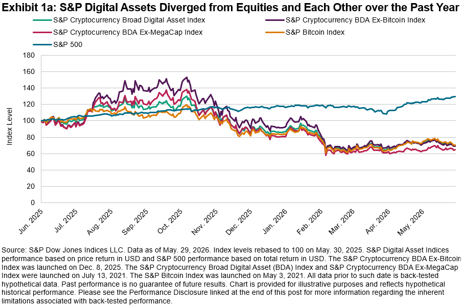
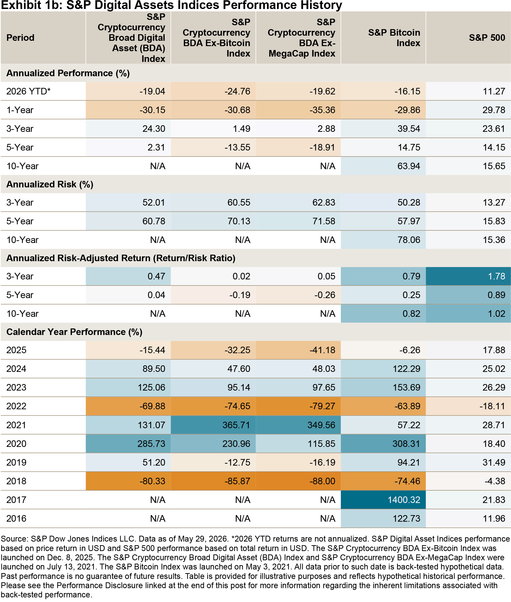
To better align measurement with mandate, Watkins said Syncracy Capital uses an S&P DJI benchmark—the S&P Cryptocurrency BDA Ex-MegaCap Index—that excludes the mega caps, specifically Bitcoin and Ethereum, as a more representative proxy for the part of the market in which the fund actually invests.
In Exhibit 1, we show the performance of the S&P Cryptocurrency Broad Digital Asset (BDA) Index versus the S&P Cryptocurrency BDA Ex-MegaCap Index. The past year has highlighted the stark difference in behavior and performance characteristics between the S&P 500 and cryptocurrency indices, across indices that both include and exclude Bitcoin. 2025 and 2026 have highlighted the importance of looking under the hood of digital asset indices.
Learn more about our capabilities and view the full webinar replay.
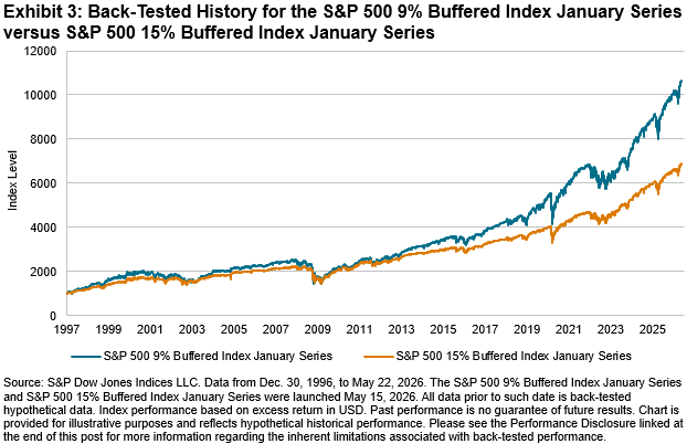
The posts on this blog are opinions, not advice. Please read our Disclaimers.Introducing the S&P 500 Defined Outcome Index Series

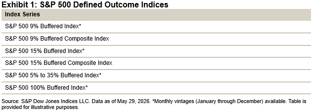
Since the launch of the first defined outcome ETF in 2018, defined outcome strategies have moved from the margins to mainstream. In markets shaped by concentration risk, volatility and interest rate uncertainty, strategies that offer market participants upside participation with downside protection—via caps, buffers, floors and outcome periods—may help offset the risk of long-only equity exposure. With defined outcome ETF assets estimated at more than USD 78 billion,1 the need for benchmarks that reflect those strategies with greater precision is greater than ever, and S&P Dow Jones Indices has introduced the S&P 500® Defined Outcome Index Series to meet this need.2
These indices were built to measure options-based outcome structures tied to the S&P 500 with a level of specificity that mirrors how investors use these strategies. Rather than treating defined outcome investing as a single category, the new benchmarks recognize that outcomes vary by downside buffer, upside participation framework and outcome period. The result is a broader index architecture spanning monthly vintages and several distinct exposure profiles, including 9% buffered, 15% buffered, 5% to 35% buffered and 100% buffered strategies, along with composite benchmarks designed to give a wider view across vintages. The indices have back-tested history back to 1996, which provides insight into hypothetical performance. With this data, we are able see how these strategies have performed across multiple market regimes and several key market stress events, including the dotcom bubble and crash, the 2007-2008 Global Financial Crisis and the COVID-19 pandemic.
Timing and structure are both critical elements of defined outcome strategies. A one-year buffered strategy that starts in January is different from one beginning in June. Similarly, a partial buffer and a deep buffer serve different purposes and suit different risk tolerances. Defined outcome strategies represent tradeoffs, as greater downside protection comes at the cost of greater upside potential.

Market participants may use these indices to help match outcome-oriented exposures with client objectives, whether that be mitigating drawdowns, reducing sequence risk or maintaining a more deliberate balance between protection and upside potential. A benchmark family that reflects those distinctions gives market participants a transparent way to compare exposures and better understand potential strategy behavior.
A benchmark should do more than provide a reference point; it should help provide transparency into the mechanics of performance. The dedicated S&P 500 Defined Outcome Index Series provides a more rigorous framework for measuring buffered equity strategies.
1 Morningstar as of year-end 2025.
2 For more information, please see the S&P 500 Defined Outcome Indices Methodology.
The posts on this blog are opinions, not advice. Please read our Disclaimers.Cashing in the Chips?

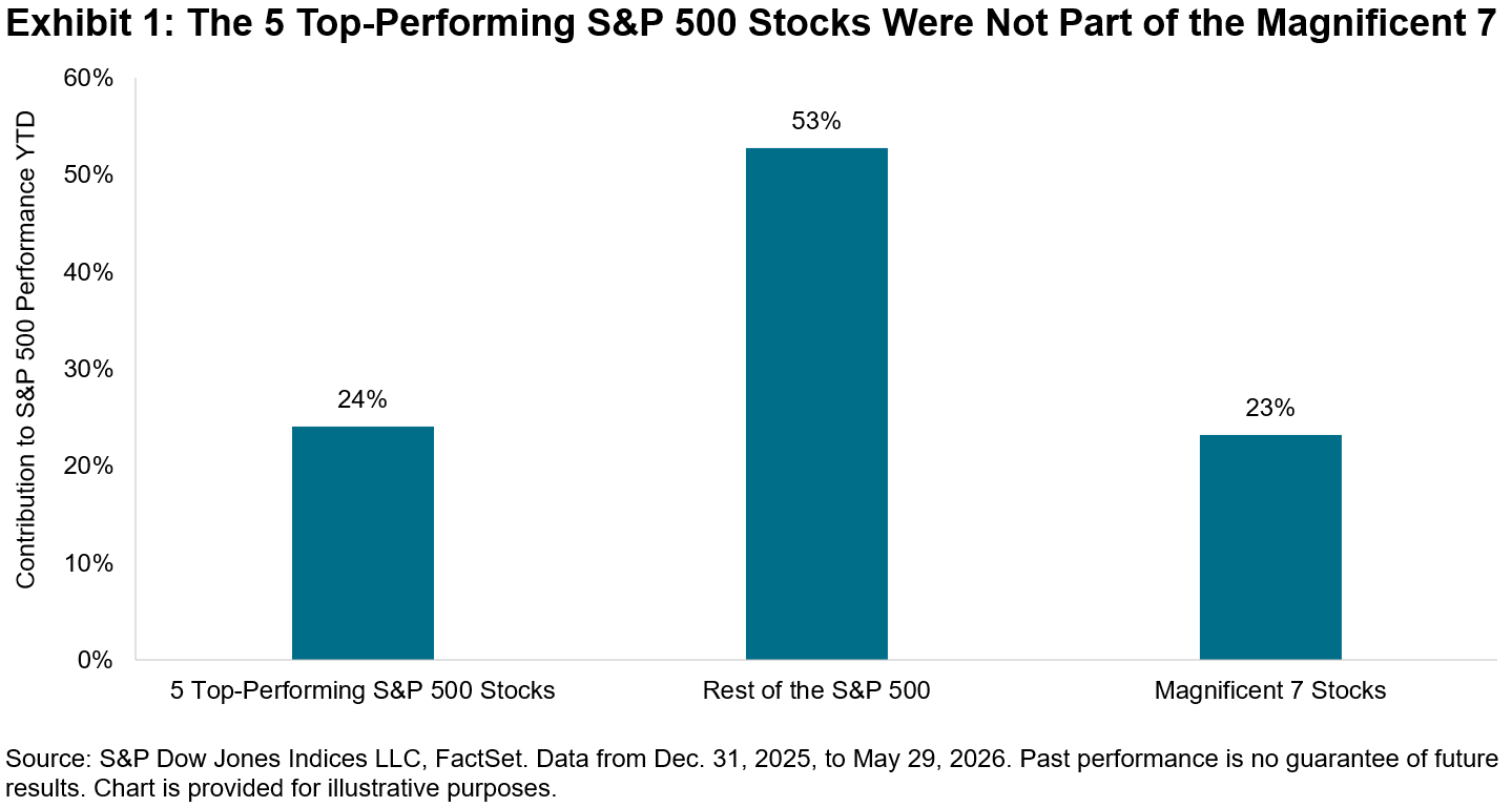
The rally in U.S. equities continued in May, with the S&P 500® posting 11 all-time closing highs during the month. A key catalyst for the market’s upward march has been optimism surrounding companies benefiting from the boom in AI. The beneficiaries of the investment in AI are no longer just the mega-cap hyperscalers, but the rapidly growing companies situated within the technology hardware and semiconductors industries.
Exhibit 1 shows that almost a quarter of the S&P 500’s YTD performance was contributed by the five top-performing stocks within the 500. Notably, none of these companies are part of the “Magnificent 7”, the members of which contributed a similar magnitude to the index’s performance. Instead, these leaders are part of a growing cohort of chipmakers, including the latest addition to the trillion dollar club Micron Technology, as well as older stalwart and survivor of the tech bubble Intel.
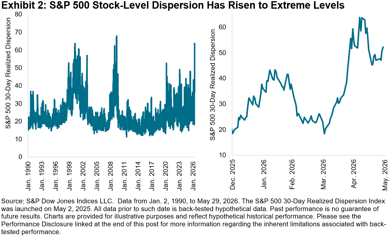
As investors have become more discerning in assessing the winners and losers of the AI trade, cross-sectional volatility—or dispersion, which measures how differently stocks are performing relative to each other—has risen to extreme levels relative to history. These levels were surpassed only by May 2009, as the market began its recovery from the Global Financial Crisis. The value of stock-selection skill rises when dispersion is high, which can mean greater opportunities for skillful stock pickers to outperform.
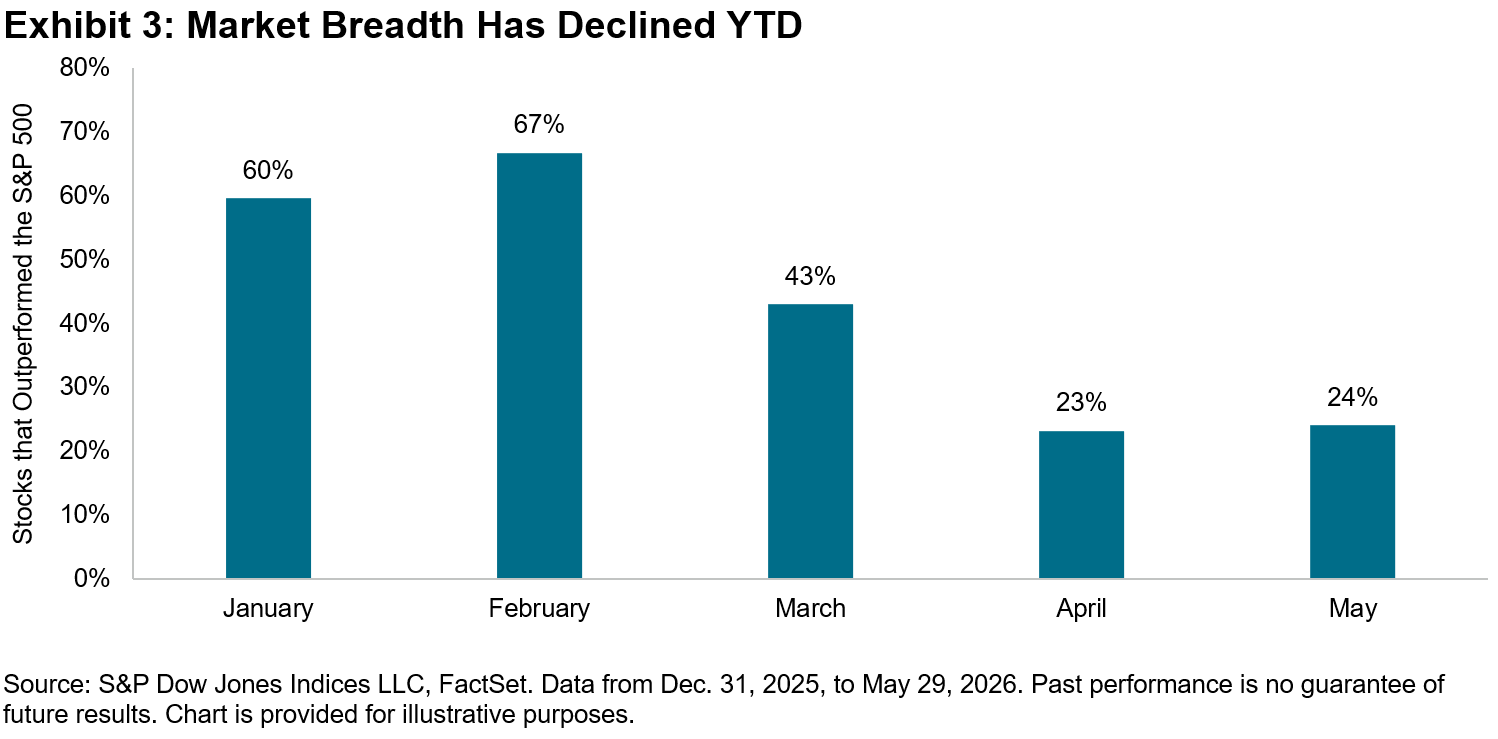
Meanwhile, although the spread between outperforming and underperforming stocks has widened, market breadth—defined as the percentage of stocks outperforming the benchmark—has steadily declined this year. In May, 24% of stocks beat the S&P 500, declining by more than half compared to February, when 67% of stocks outperformed the index. Since then, market leadership has become more concentrated, shifting from smaller caps to a handful of large caps, which can make conditions more challenging for high-conviction managers who may be underweight the largest stocks while also holding a fewer number of the likely winners.
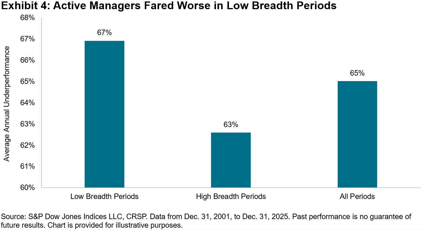
Active managers generally fared better during high dispersion periods, but how have stock pickers fared historically during periods of narrow breadth? Looking to history for a better understanding of active manager performance trends, we can analyze the 25-year history of our SPIVA® U.S. Scorecard, which measures the performance of active managers versus their appropriate benchmarks.
In Exhibit 4, we divided the years in our SPIVA database into low and high breadth periods, defined as when the percentage of stocks beating the benchmark S&P 500 was below 50% and above 50%, respectively. As expected, large-cap managers generally did worse in low breadth periods, with 67% underperforming the S&P 500, higher than the 63% during high breadth periods. Still, high breadth regimes were characterized by majority underperformance.
As we approach the second half of 2026, we can look to implied dispersion to understand the potential for future opportunities for stock selection. The Cboe S&P 500 Dispersion Index (DSPX), which uses listed options to measure the expectations for dispersion over the next 30 calendar days, rose to a one-year high of 42.01 on the last trading day of May. This means the market expects that the spread of annualized S&P 500 stock returns will have a standard deviation of 42% next month and may signify positive prospects for active stock selection.
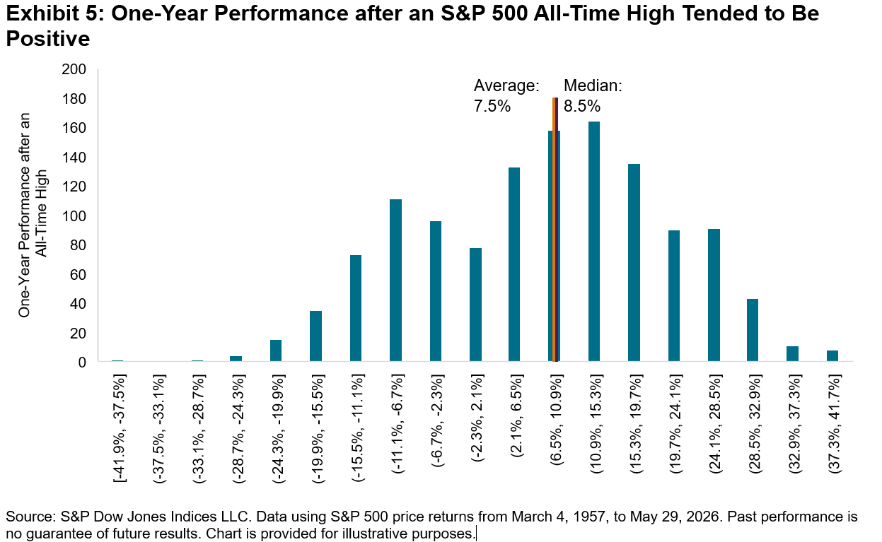
But if the market continues its advance upwards and breadth remains narrow, that could create a higher hurdle for constituent stocks to beat and for the stock pickers attempting to outperform the benchmark. Exhibit 5 shows that, historically, S&P 500 all-time highs have been followed by an annual average gain of 7.5%, slightly below the median of 8.5%. Extremes include the 42% decline after the all-time high in October 2007, when the market subsequently entered a bear market, and the 40% gain after the all-time high in October 1996, when the market continued its momentous bull run.
Today’s environment, characterized by soaring valuations and the fervor toward spending on memory chips, is reminiscent of the late 1990s. Of course, the dot-com bubble popped in 2000, but no one knows if we are in the midst of a bubble that may soon burst. For those high-conviction managers who may be capitalizing on a higher dispersion environment, the headwinds from narrow breadth may be a much-needed warning.
The posts on this blog are opinions, not advice. Please read our Disclaimers.